User Research
01
User Persona
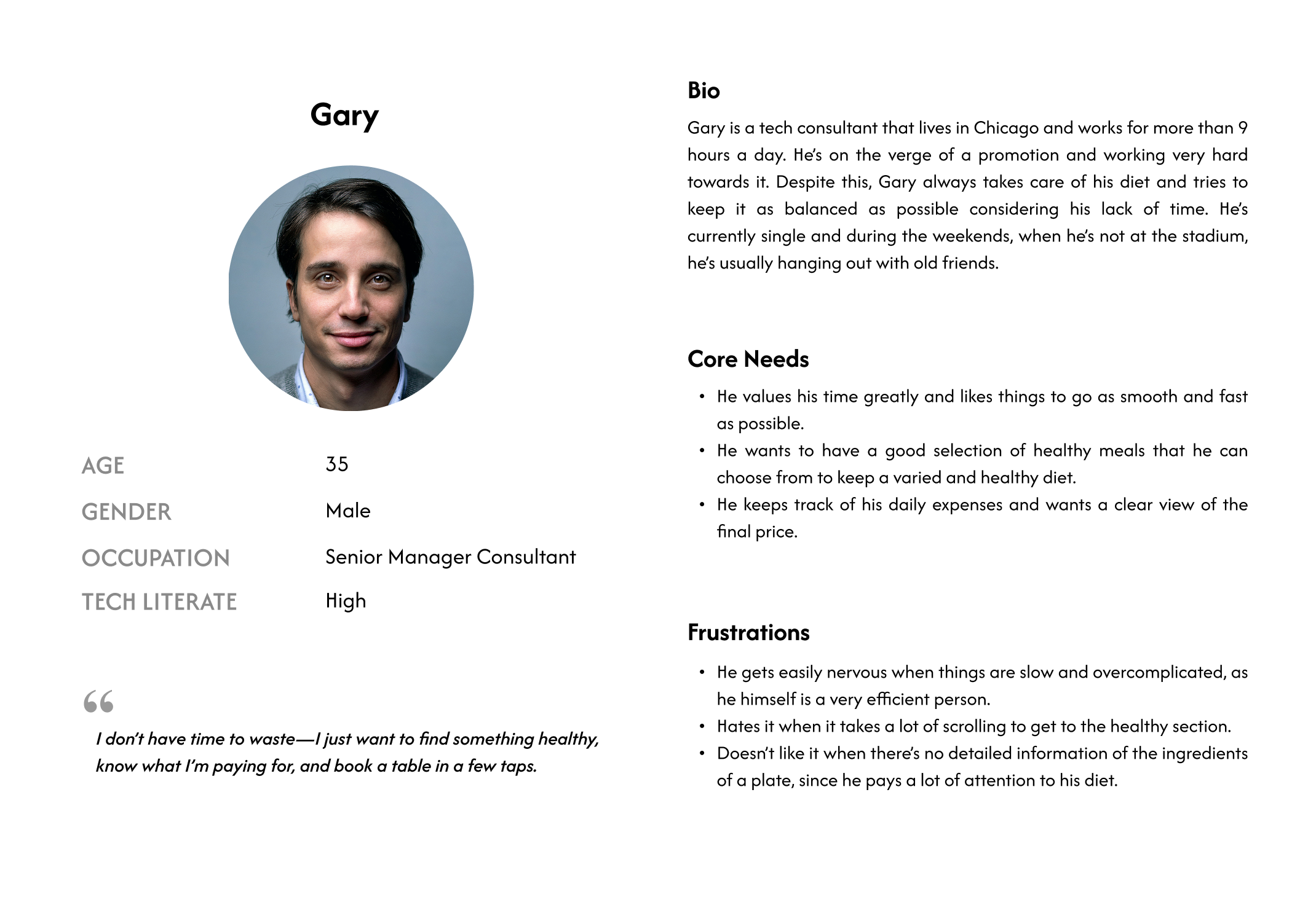
To inform the redesign process, I created a hypothetical user persona based on the scenario and guidance provided in the course. While not based on real user research, this persona helped establish a clearer picture of a typical user’s goals, frustrations, and needs when booking a table. It served as a foundation for making user-centered design decisions throughout the project.
02
User Journey
As part of the design process, I developed a hypothetical user journey map reflecting a typical experience with the current reservation feature. Based on the course materials, this journey highlights common usability issues and emotional touchpoints. It was a valuable tool for identifying pain points and opportunities for improving the flow into a more seamless and satisfying user experience.

03
Key Improvement areas
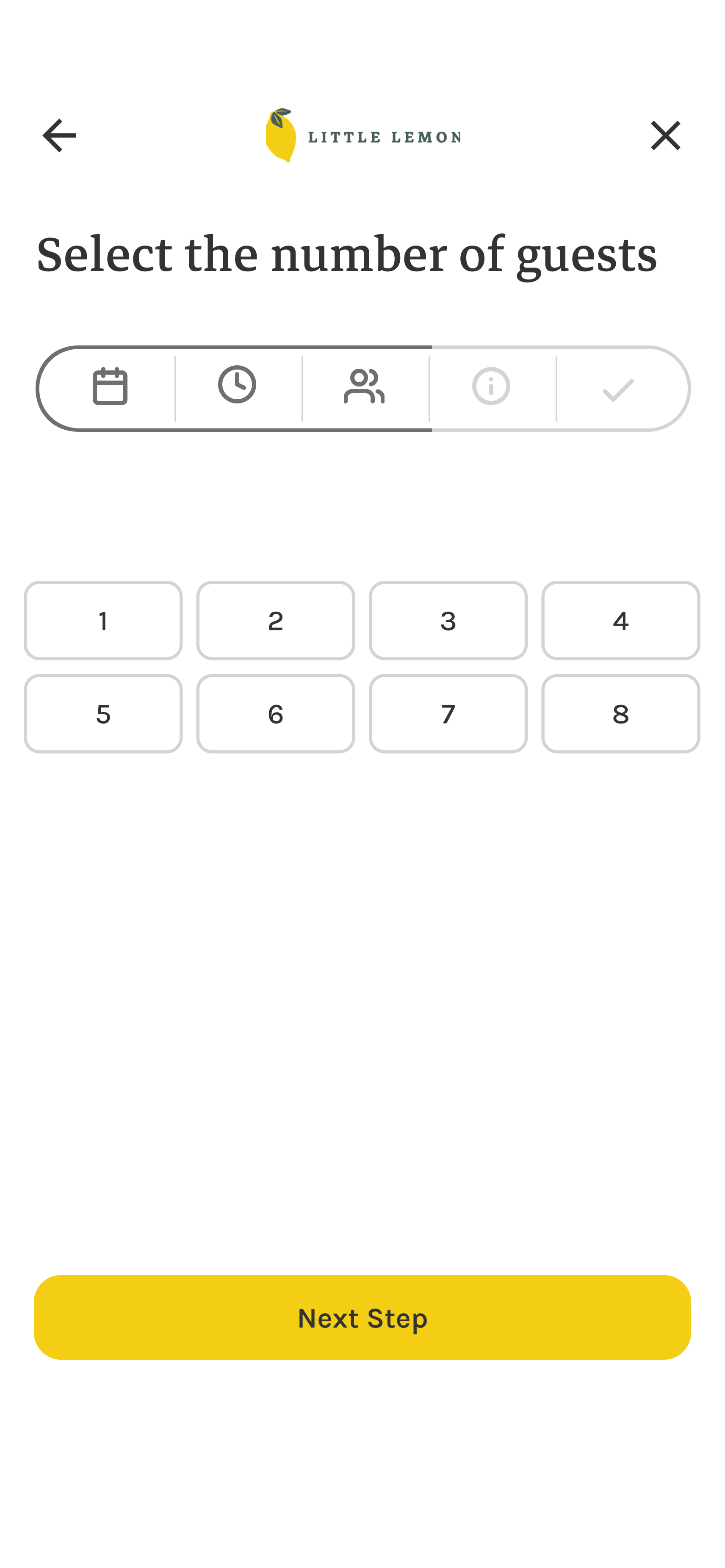
By analyzing the hypothetical user persona and journey map, I identified several pain points in the current reservation flow. These insights shaped the redesign, focusing on making the experience more intuitive, efficient, and user-friendly. Below are the key areas I aimed to improve.
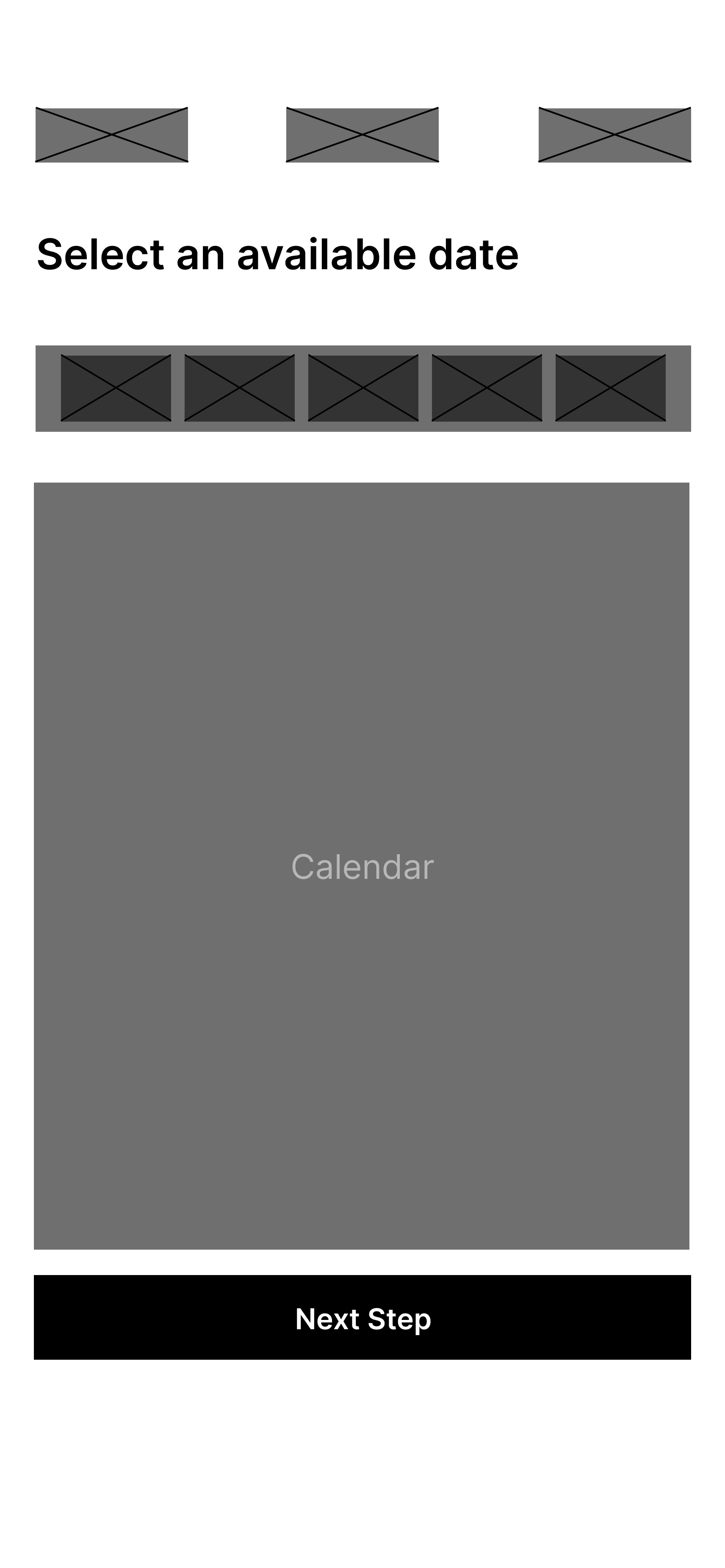
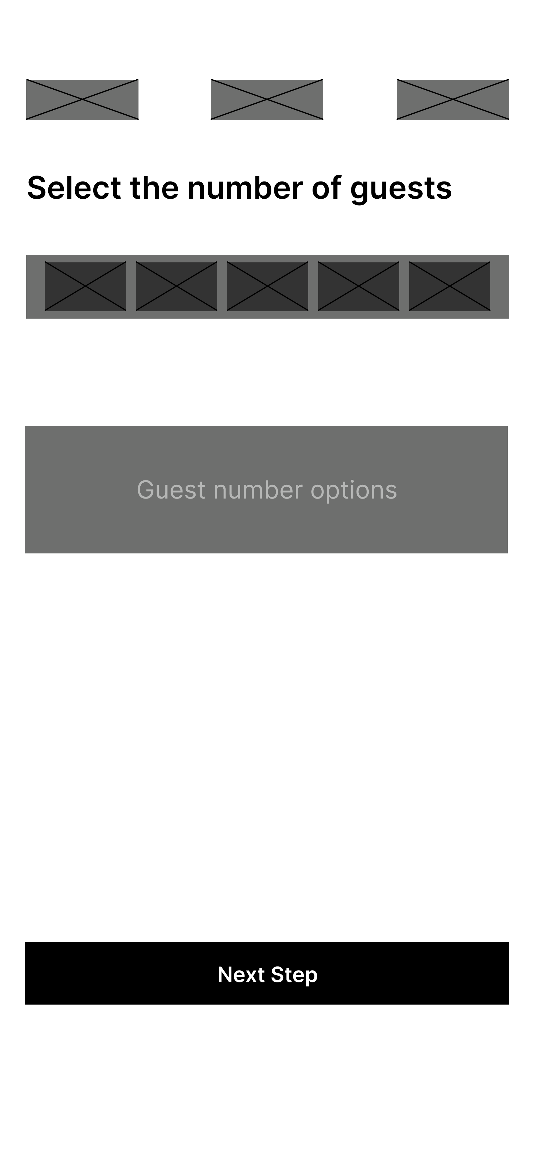
Clear navigation and indicators
- Improve the time selection interface to make available slots obvious.
- Ensure tappable elements like the number of guests are visually distinct and intuitive.
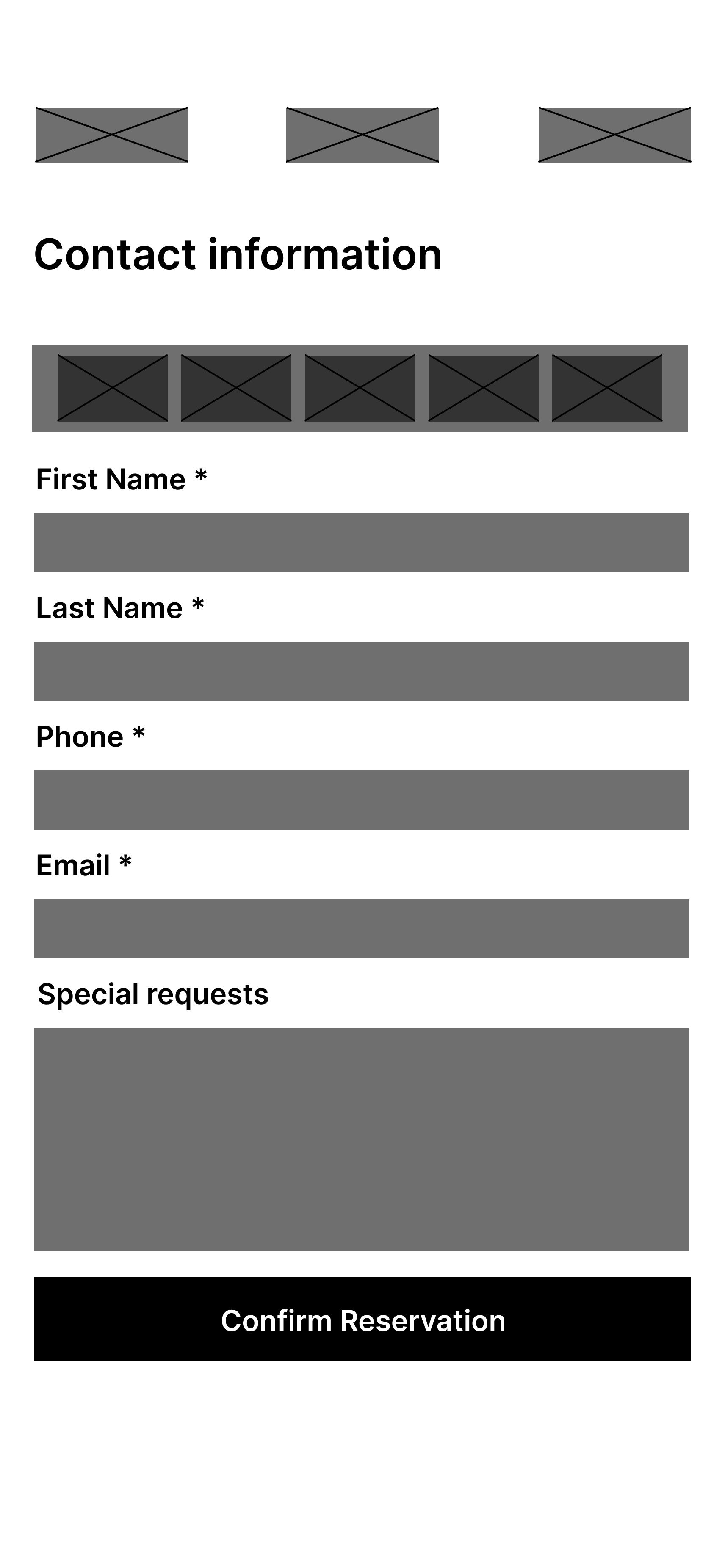
Simplify and clarify the form
- Highlight mandatory fields and provide clear instructions.
- Include fields for special requests, like dietary restrictions.
Error feedback and recovery
- Provide meaningful error messages with suggestions to fix the issue.
- Allow users to go back and edit without losing previous inputs.
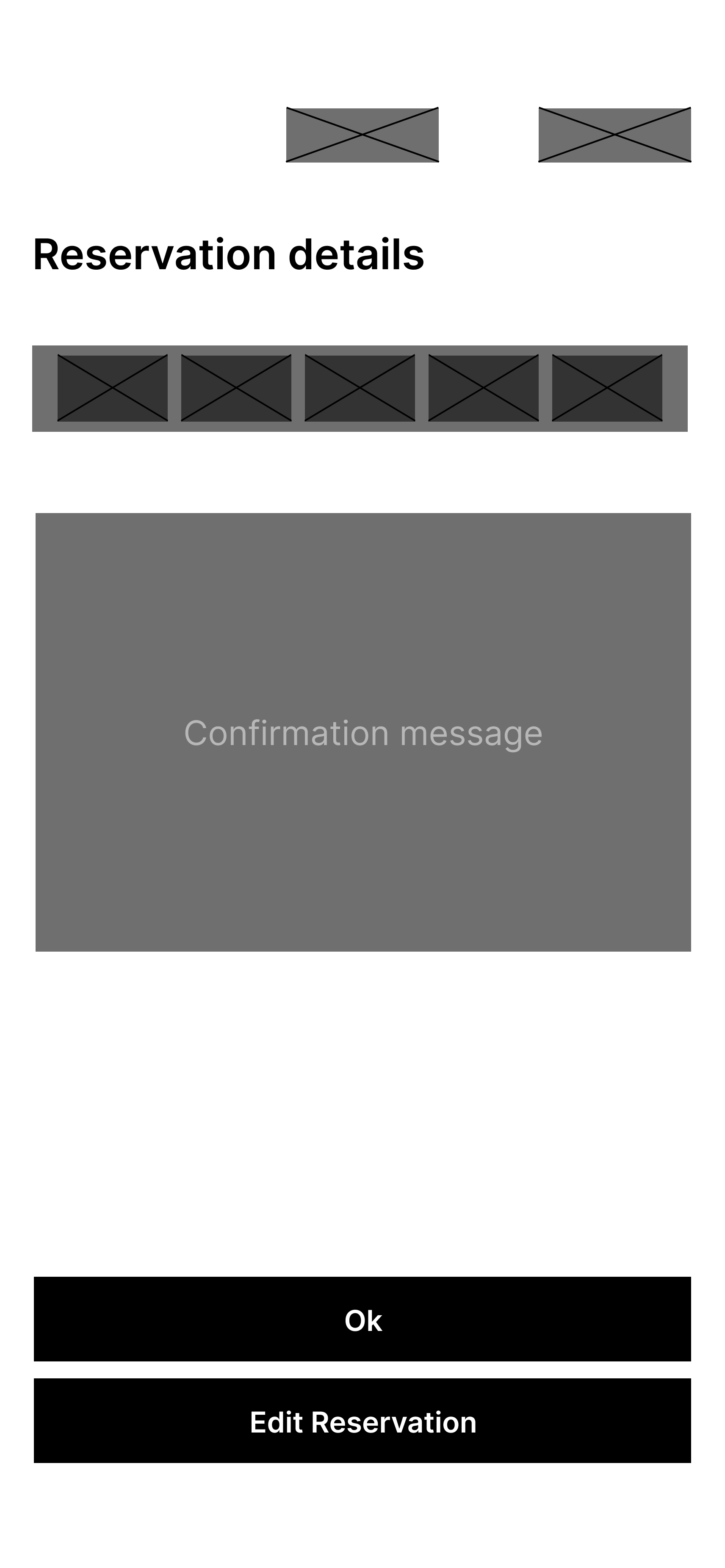
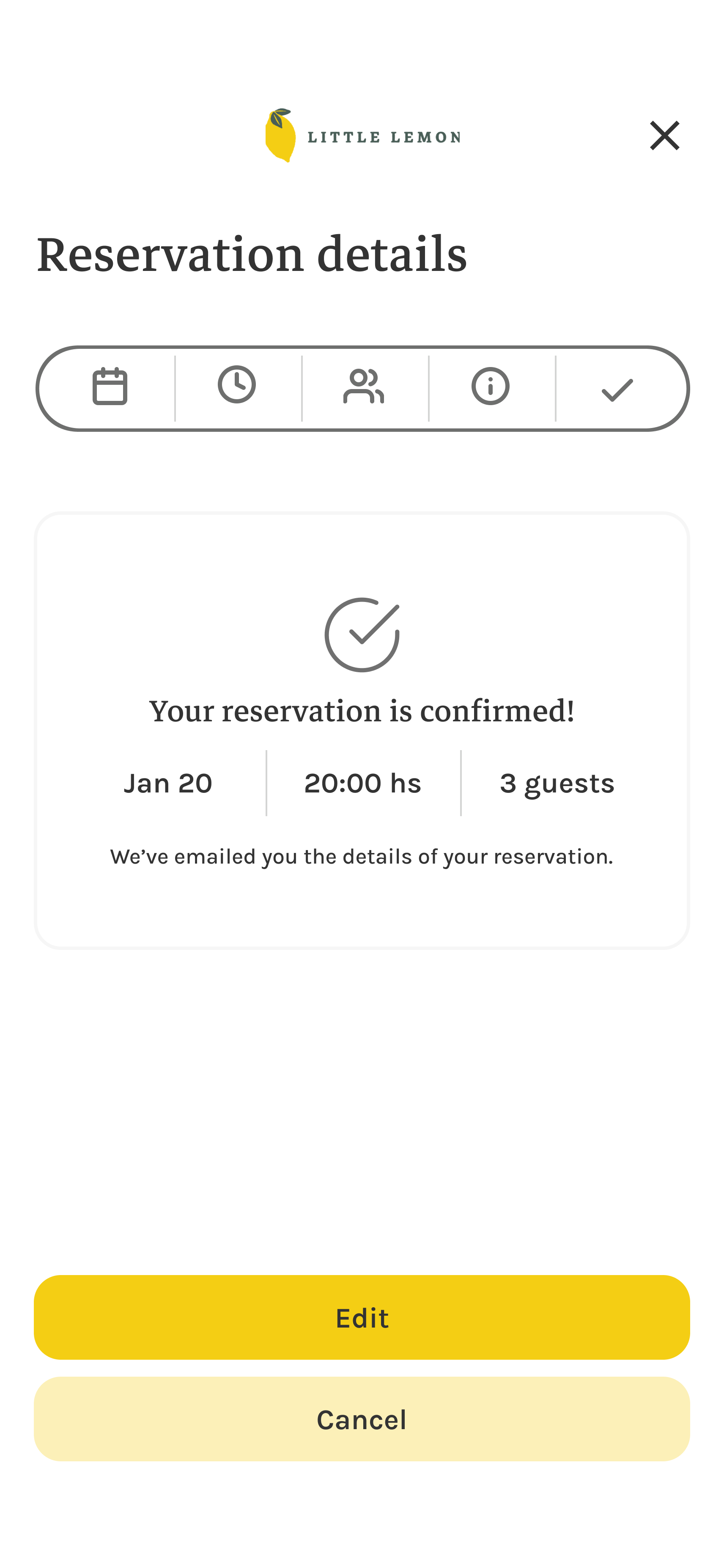
Post-confirmation feedback
- Display a success screen with reservation details and send an email confirmation.
- Provide an option to modify or cancel the reservation after confirmation.